Accessibility in mobile apps means designing and building software that people with disabilities can perceive, understand, navigate, and operate on phones and tablets. In practice, that includes support for screen readers, captions, sufficient color contrast, scalable text, clear focus order, large touch targets, motion controls that can be disabled, and forms that provide understandable feedback. Digital accessibility is the broader discipline behind those choices. It covers websites, documents, software, and mobile experiences, and it is guided by standards such as the Web Content Accessibility Guidelines, platform-specific guidance from Apple and Google, and, in many sectors, legal obligations under disability rights laws.
This matters because mobile is now the primary way many people bank, learn, shop, book care, and communicate. If an app cannot be used with VoiceOver or TalkBack, if text breaks when users enlarge it, or if a checkout flow depends on color alone, the barrier is immediate and costly. I have seen teams spend months polishing visual design only to discover during testing that a blind user could not complete account creation and a user with tremors could not hit a tiny confirmation button. Those failures are not edge cases. More than a billion people worldwide live with some form of disability, and many more experience temporary or situational limitations, such as a broken arm, glare in sunlight, or holding a baby with one hand.
Accessibility also improves product quality for everyone. Better labels help voice interfaces. Strong contrast helps people in bright environments. Larger tap areas reduce mis-taps. Clear error messages lower support costs and abandonment. For a hub article on digital accessibility, the key point is simple: accessible mobile apps are not a special version of the product. They are the product done properly, with inclusive design, robust engineering, and testing that reflects real human variation.
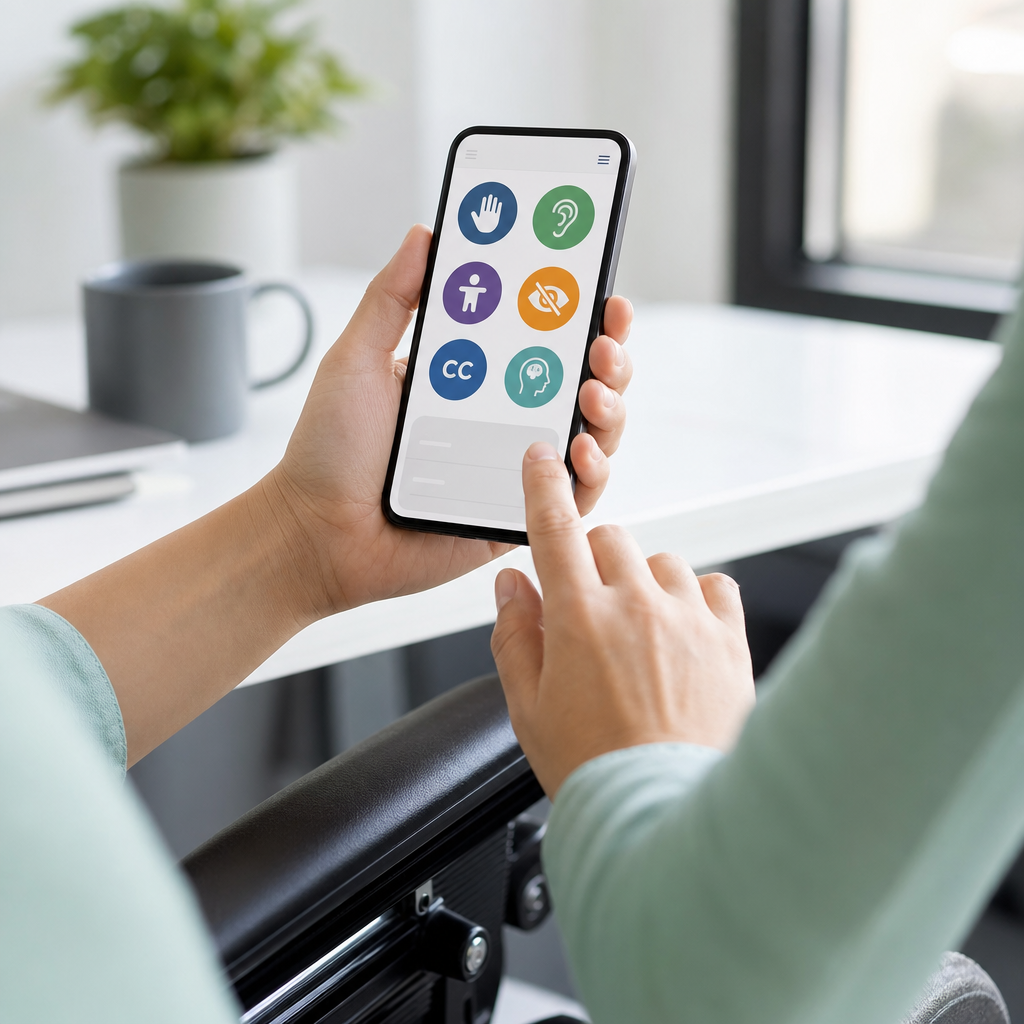
To understand accessibility in mobile apps, it helps to define the main categories of need. Visual access covers blindness, low vision, color vision deficiency, and sensitivity to glare or motion. Hearing access includes deaf and hard-of-hearing users who need captions, transcripts, or visual alternatives to sound-based alerts. Motor access concerns users who navigate with switches, external keyboards, voice control, or limited reach and dexterity. Cognitive access includes attention, memory, reading, language, and processing differences; these users benefit from predictable navigation, plain language, and reduced complexity. Many users sit across more than one category, and their needs change with context, device, and health.
Standards, laws, and platform guidance
The baseline standard most teams use is WCAG, currently version 2.2, with success criteria organized under four principles: perceivable, operable, understandable, and robust. WCAG was written to be technology-agnostic, so mobile teams must translate it into native components, gestures, and platform behavior. Apple’s Human Interface Guidelines and Accessibility Programming Guide explain how iOS features such as VoiceOver, Dynamic Type, Switch Control, AssistiveTouch, and Reduce Motion should be supported. Google’s Material guidance and Android accessibility documentation do the same for TalkBack, accessibility focus, heading semantics, live regions, touch target sizing, and user preference settings.
Legal requirements vary by country and industry, but the trend is clear: inaccessible digital services create compliance risk. In the United States, the Americans with Disabilities Act and Section 504 obligations often shape expectations, while Section 508 directly governs federal procurement. In the European Union, the European Accessibility Act is pushing digital products toward more consistent requirements. Regulated industries such as banking, health care, transportation, education, and public services face especially high scrutiny because mobile access is often essential, not optional. Legal compliance is not the whole reason to invest in accessibility, but it is a strong business argument for doing the work early.
One lesson from shipping real apps is that standards must be operationalized. A design file saying “accessible” means nothing unless teams set acceptance criteria, define component behavior, and test with assistive technologies on actual devices. Successful teams map WCAG criteria to native implementation details, build accessible design system components, and include accessibility checks in code review, QA, and release gates.
Core principles for accessible mobile app design
Accessible mobile app design starts with perception. Every important element needs a text alternative or accessible name that communicates purpose, not just appearance. An icon-only button labeled “button” is useless to a screen reader user; “Start workout,” “Add payment method,” or “Open camera” is actionable. Structure matters too. Headings, grouped controls, and logical reading order help users understand screens quickly. On mobile, that means ensuring assistive technologies move through content in a sensible sequence and do not jump unpredictably between decorative and interactive items.
Operability is the next priority. Users must be able to complete tasks without relying on a single gesture, precise movement, or time-sensitive interaction. Avoid making core actions depend solely on swipe gestures, drag and drop, long press, or device shaking. Provide visible controls and alternatives. Touch targets should generally be at least 44 by 44 points on iOS and 48 by 48 density-independent pixels on Android. Those numbers are not arbitrary; they reflect practical hit area sizes that reduce errors for users with limited dexterity and for anyone using a phone while walking or commuting.
Understandability is where many apps fail despite good intentions. Labels should match what users expect. Instructions should appear before input, not after a failed attempt. Error messages should identify the field, explain the problem, and suggest a fix. If a password needs twelve characters, a symbol, and no spaces, say so up front. If a form uses verification codes, support auto-fill where possible and avoid timing people out without warning. Plain language is not dumbing down. It is precision that reduces cognitive load.
Robustness means building with native semantics and exposing UI state correctly to assistive technologies. A custom toggle must announce whether it is on or off. A loading indicator should not trap focus. Dynamic updates, such as “added to cart,” should be announced without forcing a user to explore the whole screen again. Native controls usually get this behavior right more reliably than highly customized interfaces, which is why accessibility often aligns with maintainability and performance.
Common mobile accessibility failures and how to prevent them
The most common failure I see is unlabeled controls. Designers love clean iconography, but if developers do not assign accurate accessibility labels, screen reader users hear “button” repeated across the screen. The fix is simple and must be intentional: every actionable element needs a specific name, and decorative elements should be hidden from assistive technology. The second common failure is broken text scaling. Teams test at default font size, then discover at 200 percent that labels truncate, buttons overlap, and content disappears under fixed-height containers. Support Dynamic Type on iOS and scalable text on Android from the start, and test the largest settings on small devices.
Another frequent issue is poor contrast and color-dependent meaning. Light gray text on white backgrounds may look elegant in mockups but becomes unreadable in glare or for users with low vision. WCAG contrast ratios provide measurable thresholds, but practical testing matters too. If an error state is shown only by turning a border red, users with color vision deficiency may miss it. Add text, icons, or patterns. Motion is another risk. Auto-playing carousels, parallax effects, and animated transitions can trigger vestibular discomfort or simply distract. Respect system settings such as Reduce Motion and allow users to pause or disable movement where necessary.
Authentication flows deserve special attention because they often combine many barriers at once. CAPTCHA challenges may be inaccessible. One-time code fields may split digits into tiny boxes that screen readers read awkwardly. Session timeouts may expire during password manager use. Biometric login can be helpful, but it must not be the only path. Inclusive authentication means offering multiple methods, clear instructions, and recovery options that work with assistive technology.
| Issue | User impact | Practical fix |
|---|---|---|
| Icon buttons without labels | Screen reader users cannot identify actions | Add meaningful accessibility labels and hide decorative icons |
| Small tap targets | Users with tremors or large fingers mis-tap | Meet platform target sizes and add spacing |
| Text that does not scale | Low-vision users lose content at larger sizes | Use flexible layouts and test maximum text settings |
| Color-only error states | Users miss status changes or validation errors | Pair color with text, icons, and programmatic announcements |
| Custom controls with no semantic state | Assistive tech cannot report checked, selected, or expanded states | Use native controls or expose roles, names, and states correctly |
How to build accessibility into design and development
Digital accessibility is easiest when it is embedded in the product lifecycle. In discovery, define who may be excluded by the current concept and which user journeys are critical, such as sign-up, search, purchase, booking, messaging, or requesting support. In design, create accessible component libraries with documented behaviors for buttons, tabs, modals, lists, cards, form fields, error states, and bottom sheets. Specify focus order, labels, helper text, contrast tokens, and motion behavior. In content design, write labels and guidance in plain language with consistent terminology. In engineering, prefer native components unless there is a strong reason not to.
Testing should happen at three levels. First, automated scanning catches obvious issues such as missing labels, low contrast in some contexts, or small touch targets. Useful tools include Accessibility Scanner on Android, Xcode Accessibility Inspector on iOS, axe DevTools for supporting surfaces, and linting rules in design systems. Second, manual QA validates gesture alternatives, reading order, screen reader announcements, keyboard or switch navigation, and text scaling. Third, moderated testing with disabled users reveals the gaps automated checks cannot find, especially around comprehension, trust, and task completion. In every mature program I have supported, user testing changed priorities more than any scanner ever did.
Teams also need governance. Add accessibility acceptance criteria to stories, include checks in pull requests, and track defects with the same severity discipline used for security or payment bugs. When designers, researchers, engineers, QA analysts, and product managers share responsibility, accessibility stops being a late-stage audit and becomes a quality attribute of the whole app.
Assistive technologies, device features, and inclusive content
Understanding assistive technology is essential because accessibility is not just a checklist; it is an interaction model. On iOS, VoiceOver reads accessible names, traits, values, and hints while users navigate by swiping through elements or exploring by touch. On Android, TalkBack serves a similar role. Switch Control and external keyboards allow sequential navigation without touch. Voice Control enables spoken commands. Magnification, bold text, color filters, captions, and hearing device support all change how users experience an app. If an interface only works for direct touch with standard vision and hearing, it is fragile by design.
Content choices are just as important as technical implementation. Write button labels that start with verbs when action matters. Use sentence case rather than all caps for readability. Break long forms into logical steps, but avoid hiding important context. For media, provide captions for video, transcripts for audio, and avoid essential information delivered only through sound. For images in onboarding or commerce, ensure alt-like descriptions or accessible names communicate function when the image itself carries meaning. For data visualizations inside apps, expose summaries and key values in text so users do not need to interpret color-coded charts to understand their spending, health trend, or account status.
Localization adds another layer. Accessible names, error messages, and instructions must be translated accurately, fit longer strings, and remain understandable in regional context. I have seen otherwise solid apps fail in German and Finnish because fixed containers clipped critical text, and in Arabic because focus order and visual alignment were not adapted for right-to-left layouts. Accessibility and internationalization are tightly connected because both require flexible interfaces and respect for real user contexts.
Measuring success and maintaining accessibility over time
An accessible release is not the finish line. Mobile apps change constantly, and regression is common when teams add features quickly. Measure accessibility with both conformance and outcome metrics. Conformance metrics include the percentage of screens tested with screen readers, defects by severity, support for large text, target size coverage, and contrast pass rates. Outcome metrics include task completion rates for disabled participants, form abandonment, support tickets related to usability, and app store reviews mentioning readability, captions, login friction, or navigation problems. Pair these metrics with a clear remediation process and accountable owners.
The broader benefit of digital accessibility is resilience. Accessible apps reach more customers, reduce friction across diverse situations, and adapt better to new interfaces, whether that is voice interaction, wearable extensions, in-car systems, or AI-assisted experiences that depend on clean semantics. For this hub topic, the central lesson is straightforward: accessibility in mobile apps is a product strategy, a design discipline, and an engineering practice. Start with standards, use native patterns, test with assistive technology, involve disabled users, and treat every release as a chance to remove barriers. Audit your most important mobile journey this week, document the blockers, and fix the first five issues before the next sprint.
Frequently Asked Questions
What does accessibility in mobile apps actually mean?
Accessibility in mobile apps means designing and building apps so people with disabilities can use them effectively on phones and tablets. That includes users who are blind or have low vision, people who are deaf or hard of hearing, individuals with limited mobility or dexterity, and users with cognitive, learning, or neurological differences. In practical terms, an accessible app can be perceived, understood, navigated, and operated by a wide range of people, whether they rely on screen readers, captions, voice control, switch access, larger text settings, or reduced motion preferences.
In a mobile context, accessibility shows up in many day-to-day design decisions. Examples include labeling buttons so screen readers can announce them correctly, maintaining sufficient color contrast so text remains readable, supporting scalable text without breaking layouts, providing a logical focus order for keyboard or assistive navigation, and making touch targets large enough to tap accurately. It also means avoiding interactions that depend only on gestures, color, sound, or motion, unless accessible alternatives are available.
Accessibility is part of the broader discipline of digital accessibility, which applies to websites, documents, software, and other digital experiences. For mobile apps, the goal is not simply compliance or checking a box. It is creating a product that works for more people in real-world situations. That benefits users with permanent disabilities, users with temporary limitations like an injured hand, and even users in changing environments such as bright sunlight, noisy spaces, or when using one hand on the go.
Why is mobile app accessibility important for businesses and product teams?
Mobile app accessibility matters because it directly affects who can use your product and how successfully they can complete important tasks. If an app is difficult to navigate with a screen reader, impossible to read at larger text sizes, or confusing for users who need clear instructions and feedback, it excludes potential customers and creates unnecessary barriers. For businesses, that can mean lost conversions, lower retention, weaker brand trust, and a product experience that fails a significant portion of the market.
There are also legal and policy considerations. While specific requirements vary by country and industry, accessibility expectations are growing across the digital landscape. Organizations increasingly look to established standards and best practices to reduce risk and demonstrate that their products are usable by people with disabilities. Building accessibility into mobile apps early is usually far more efficient than retrofitting an app after launch, especially when issues affect core navigation, forms, media, or interaction patterns.
Just as important, accessibility improves usability for everyone. Captions help users in quiet and noisy environments. Clear form errors reduce abandonment. Strong contrast improves readability outdoors. Larger touch targets help when users are distracted or using a device one-handed. In other words, accessibility often overlaps with quality, clarity, and customer experience. Teams that prioritize it usually create apps that are more resilient, intuitive, and user-friendly across a much broader range of situations.
What features and design practices make a mobile app accessible?
An accessible mobile app is built from a combination of technical support, thoughtful design, and inclusive content. One of the most important foundations is compatibility with assistive technologies such as screen readers. Interactive elements should have meaningful labels, images should include useful descriptions when needed, and controls should expose the right roles and states so users understand whether an item is a button, toggle, link, or form field. Navigation should be predictable, and focus should move in a logical order as users swipe, tab, or use alternative input methods.
Visual accessibility is another major area. Text should have sufficient contrast against backgrounds, information should not be conveyed by color alone, and users should be able to increase text size without losing functionality or readability. Layouts should adapt well to dynamic type and different screen sizes. Touch targets should be large enough to activate comfortably, with enough spacing to reduce accidental taps. If the app uses animation or motion effects, users should be able to reduce or disable them, especially when motion could cause discomfort or distraction.
Audio, video, and form interactions also deserve close attention. Videos should include captions, and audio-only content may need transcripts. Forms should provide clear labels, instructions, and understandable error messages that explain what went wrong and how to fix it. Time limits, gesture-based controls, or device motion interactions should not create barriers without alternatives. The strongest mobile accessibility work comes from treating these elements as part of the core product experience, not as optional add-ons added at the end.
How can developers and designers test accessibility in a mobile app?
Testing mobile accessibility works best when teams combine automated tools with manual review and real-user perspective. Automated testing can help catch common issues such as missing labels, poor contrast, or certain structural problems, but it cannot tell you whether the overall experience is understandable, efficient, or logically organized. That is why manual testing is essential. Designers and developers should use built-in accessibility features on iOS and Android, including screen readers, text scaling settings, reduced motion preferences, color adjustments, and keyboard or switch navigation where supported.
A good testing process includes walking through key user journeys such as signing up, logging in, searching, adding items to a cart, completing a form, or playing media. During those flows, teams should verify that every control is announced clearly, focus order follows the visual and logical structure, error messages are specific and helpful, and no interaction depends entirely on sight, hearing, precise gestures, or color recognition. Testing should also cover edge cases, such as very large text sizes, zoomed display settings, landscape orientation, and slower or interrupted interactions.
The most valuable feedback often comes from involving people with disabilities in usability testing. Real users can reveal friction points that automated tools and internal reviews may miss, especially around clarity, task completion, and cognitive load. Accessibility should also be tested continuously, not only before release. As features evolve, design systems change, and operating systems update, accessibility can improve or regress. Treating it as part of ongoing quality assurance helps teams maintain a better experience over time.
When should accessibility be addressed during mobile app development?
Accessibility should be addressed from the very beginning of the mobile app development process. The earlier it is considered, the easier and less expensive it is to build into the product. If accessibility is only reviewed near launch, teams often discover issues that require major rework, such as redesigning navigation patterns, restructuring screens, replacing custom controls, or rewriting unclear form logic. By contrast, when accessibility is included during planning, design, development, and QA, it becomes part of how the product is made rather than a late-stage obstacle.
In practice, that means product managers should include accessibility in requirements, designers should account for readable layouts, scalable text, contrast, and clear interaction patterns, and developers should use accessible native components and proper semantics wherever possible. Content teams should write concise labels, instructions, and error messages. QA teams should test with assistive technologies and accessibility settings as part of normal release readiness. When all disciplines share responsibility, the result is usually stronger and more consistent.
It is also important to treat accessibility as an ongoing commitment. Mobile apps change constantly through feature releases, interface updates, third-party integrations, and platform changes. Each change can introduce new barriers or resolve existing ones. Teams that establish accessibility standards, reusable components, and regular testing practices are much more likely to maintain an inclusive experience over time. In short, accessibility is not a one-time milestone. It is a core part of building and sustaining a high-quality mobile product.