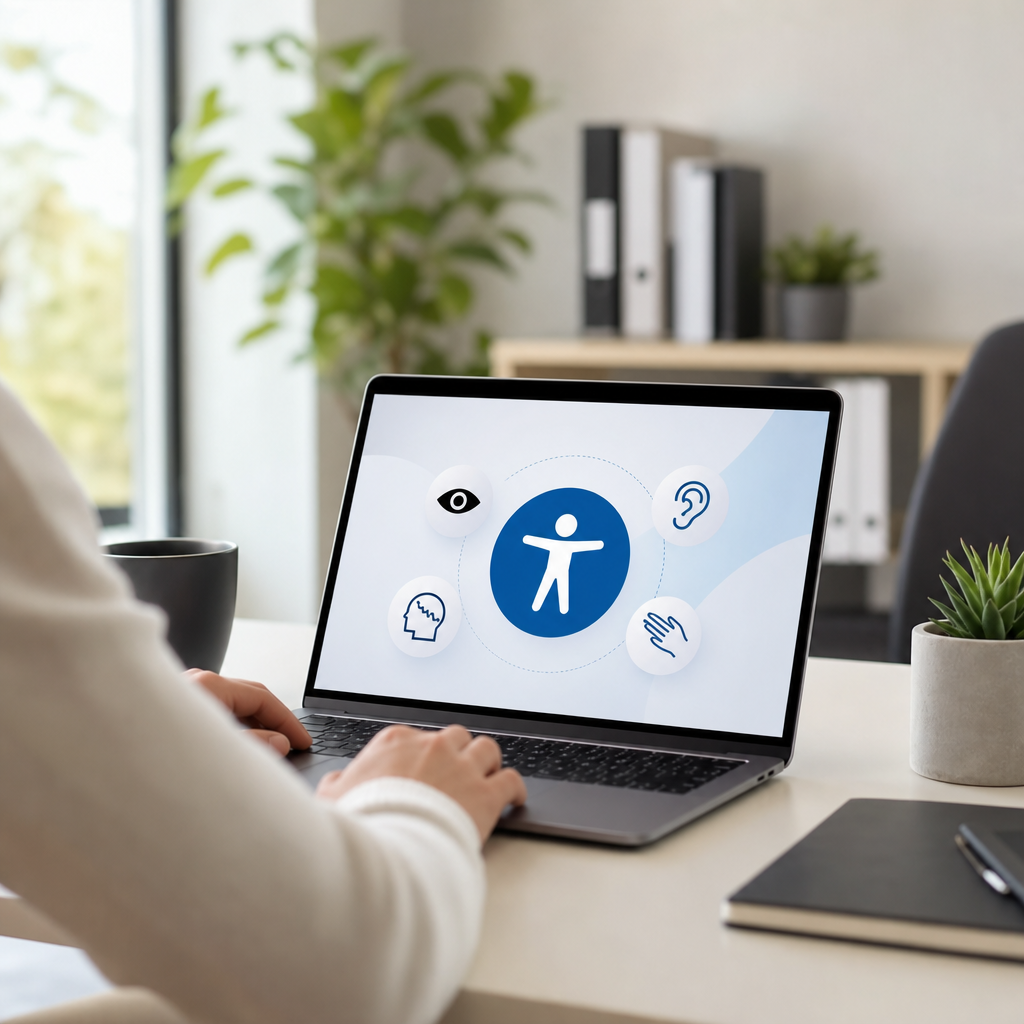
Accessibility is the practice of designing products, services, spaces, and information so people with disabilities can use them with dignity, independence, and reasonable ease. In digital work, accessibility usually refers to websites, apps, documents, and media that function for people who are blind, low vision, deaf, hard of hearing, have mobility limitations, cognitive differences, speech disabilities, photosensitivity, or temporary impairments. In physical environments, it includes entrances, routes, signage, seating, restrooms, transportation, and service design. The core idea is simple: remove barriers before they exclude people.
That definition matters because disability is common, not rare. The World Health Organization estimates that more than one billion people worldwide live with a disability. Accessibility therefore is not a niche feature request. It affects education, employment, healthcare, commerce, government services, and daily communication at massive scale. I have worked on accessibility audits for marketing sites, software platforms, PDFs, and video libraries, and the pattern is consistent: teams often assume they are building for “average users,” then discover basic tasks fail for real people using screen readers, keyboard navigation, captions, zoom, voice input, or simplified language.
Accessibility is also broader than compliance. Laws and standards are important, but the real goal is usable inclusion. A site can technically pass many checks and still frustrate users if forms are confusing, instructions depend on color alone, or a modal traps keyboard focus. Good accessibility combines technical conformance with human-centered design. It asks whether someone can perceive the content, operate the interface, understand what is happening, and recover from mistakes without unnecessary effort.
Several related terms are useful. Disability can be permanent, temporary, or situational. A broken arm can limit mouse use; bright sunlight can reduce screen visibility; a loud train can make audio unusable without captions. Assistive technology includes screen readers such as JAWS, NVDA, and VoiceOver; screen magnifiers; switch devices; braille displays; captions; and speech recognition software like Dragon. Inclusive design is the broader design approach that accounts for human diversity from the start. Universal design is a similar concept often used in architecture and product development. Accessibility is the operational discipline that turns those principles into concrete requirements and testable outcomes.
Why accessibility matters in everyday life and business
Accessibility matters because barriers create real harm. When a checkout button cannot be reached by keyboard, a customer cannot complete a purchase. When a medical portal labels form fields incorrectly, a patient may miss test results or medication instructions. When a training video lacks captions, an employee may be excluded from required learning. These are not edge cases. They are routine failures with practical consequences for safety, income, privacy, and participation.
For organizations, accessibility improves reach, resilience, and quality. Search engines read structure, headings, and alt text more effectively when content is organized semantically. Mobile usability often improves when tap targets, contrast, and readable layouts are addressed. Clear labels and predictable navigation reduce support tickets for everyone, not just disabled users. I have seen accessibility fixes lower abandonment in complex forms because better error messages and clearer instructions help all users complete tasks faster.
There is also a legal and reputational dimension. In many jurisdictions, digital accessibility is tied to civil rights and nondiscrimination obligations. In the United States, the Americans with Disabilities Act is frequently cited in digital accessibility litigation, while Section 508 applies to federal agencies and certain contractors. In Europe, the European Accessibility Act and EN 301 549 shape requirements for many digital products and services. Laws differ by region, but the trend is unmistakable: accessibility expectations are increasing, and organizations that ignore them assume unnecessary risk.
Most importantly, accessibility reflects basic fairness. People should not need extraordinary effort to read a school assignment, book a flight, submit a job application, or contact customer support. When teams build with accessibility in mind from the beginning, they reduce rework and create better experiences for more people.
The main types of accessibility
Accessibility spans multiple domains, but four categories appear most often in practice: digital, physical, communication, and organizational accessibility. Digital accessibility covers websites, software, mobile apps, electronic documents, kiosks, and multimedia. Physical accessibility addresses the built environment, including ramps, elevators, tactile warnings, restroom layouts, hearing loops, and wayfinding. Communication accessibility includes plain language, sign language interpretation, captions, transcripts, readable typography, and accessible customer support channels. Organizational accessibility covers policies, procurement, training, hiring practices, and governance that make inclusion sustainable rather than ad hoc.
Within digital accessibility, user needs vary widely. Blind users may rely on screen readers and semantic markup. Low-vision users may zoom to 200 percent or more and need strong contrast and reflowing layouts. Deaf and hard-of-hearing users need captions for prerecorded and live media, plus transcripts when practical. People with motor disabilities may navigate by keyboard, switch control, or voice commands, so controls must be reachable without fine pointer movements. Users with dyslexia, ADHD, autism, brain injury, or memory limitations may benefit from simpler content structure, consistent navigation, and fewer distractions.
The practical lesson is that accessibility is not one feature. It is a system of choices across design, code, content, media production, procurement, and quality assurance. A beautiful interface with weak heading structure is still inaccessible. Accurate captions on a video are valuable, but if the player cannot be operated by keyboard, the experience still fails. Effective accessibility work looks across the full journey, not isolated components.
Standards and principles that guide accessible design
The most widely used benchmark for digital accessibility is the Web Content Accessibility Guidelines, commonly called WCAG. Published by the World Wide Web Consortium, WCAG organizes requirements under four principles: content must be perceivable, operable, understandable, and robust. These principles are practical. Perceivable means users can detect information through sight, sound, or touch equivalents. Operable means interfaces work with different input methods, especially keyboards. Understandable means content and interactions are clear, predictable, and forgiving. Robust means code is compatible with current and future user agents, including assistive technologies.
Teams usually work toward WCAG 2.1 or 2.2 Level AA because that level is commonly referenced in policy and procurement. Some requirements are straightforward, such as providing text alternatives for meaningful images and ensuring sufficient color contrast. Others require more care, such as visible focus indicators, accessible name computation for controls, error prevention in important forms, and proper reading order in responsive layouts. The standard does not prescribe visual style; it sets outcomes that support user access.
Accessible Rich Internet Applications, or WAI-ARIA, is another important standard, but it is often misunderstood. ARIA can add semantics when native HTML is insufficient, such as identifying tabs, alerts, or dialog roles. However, the first rule of ARIA is effectively to prefer native HTML when possible. A real button element is usually better than a styled div with role=”button” because native controls come with keyboard behavior, focus handling, and browser support built in. In audits, misuse of ARIA is one of the most common causes of avoidable failures.
| Area | Common barrier | Accessible approach |
|---|---|---|
| Images | Meaning conveyed only visually | Write concise alt text or nearby text explanation |
| Forms | Placeholder used instead of label | Use persistent programmatic labels and clear errors |
| Navigation | Mouse-only menus | Support full keyboard access and visible focus |
| Video | No captions or transcript | Add synchronized captions and transcript when useful |
| Color | Status shown only by red or green | Add text, icons, and sufficient contrast |
| Documents | Tagged incorrectly or not at all | Use headings, lists, table headers, and reading order |
What accessible websites and apps actually require
An accessible website starts with structure. Pages need one clear main heading, logical heading levels, landmarks, descriptive link text, and meaningful page titles. Screen reader users commonly navigate by headings and regions, so structure is not decorative; it is navigation. Lists should be real lists. Data should be in properly marked tables with header associations. Buttons should trigger actions, and links should go to destinations. These sound basic, yet many modern sites break them through overcustomized components and rushed publishing workflows.
Keyboard accessibility is nonnegotiable. Every interactive element must be reachable and usable without a mouse. Focus order should match visual order. Skip links help users bypass repeated navigation. Dialogs must move focus into the modal when opened and return focus when closed. Drag-and-drop interactions need keyboard alternatives. If a date picker, carousel, or mega menu requires pointer precision, it should be redesigned. I routinely test interfaces by unplugging the mouse first because that simple step reveals issues quickly.
Visual accessibility requires sufficient contrast, scalable text, reflow at smaller viewports, and content that does not rely on color alone. WCAG contrast thresholds are measurable, but real usability goes beyond minimum numbers. Thin gray text on white may technically pass in some cases yet still feel fragile on low-quality screens. Stronger contrast and larger line height usually improve reading comfort. Motion should be limited or pausable, especially when animations are distracting or could trigger vestibular disorders.
Accessible media needs captions, transcripts, audio descriptions when essential visual information is otherwise missed, and players that work with keyboard and screen readers. Documents such as PDFs must be tagged correctly, with headings, reading order, alt text, language settings, and form fields that expose labels. Email campaigns also need accessibility attention: semantic headings, sufficient contrast, descriptive links, and layouts that hold up when images are off or zoom is high.
How teams build accessibility into content, design, and development
Accessibility succeeds when it becomes part of the workflow, not a final inspection. Content teams should write plain, direct language, break up dense sections with meaningful headings, avoid vague link text like “click here,” and explain acronyms on first use. Designers should define contrast-safe color tokens, component states, focus styles, spacing, error patterns, and responsive behavior in the design system. Developers should use semantic HTML first, test with keyboards and assistive technology, and document accessible component usage so patterns remain consistent across products.
Research and testing are where teams move from assumptions to evidence. Automated tools such as axe DevTools, WAVE, Lighthouse, and Accessibility Insights are useful for catching missing labels, contrast failures, empty buttons, and landmark issues. But automation does not cover everything. It will not reliably judge whether alt text is meaningful, whether instructions are understandable, or whether a complex interaction makes sense with a screen reader. Manual testing is essential, including keyboard-only checks, zoom testing, reduced-motion preferences, and screen reader passes with NVDA, JAWS, or VoiceOver depending on the audience.
The strongest programs also involve disabled users in research and usability testing. This changes priorities quickly. A development team may focus on a minor contrast issue while users struggle far more with time limits, ambiguous labels, or inconsistent navigation. Firsthand testing reveals friction that standards alone do not fully surface. In one project, technically valid form markup still produced abandonment because account recovery instructions were buried below unrelated marketing copy. A short rewrite and a clearer heading hierarchy solved more than any code patch.
Common myths, tradeoffs, and the best place to start
One persistent myth is that accessibility ruins aesthetics or slows innovation. In practice, constraints usually improve craft. Clear hierarchy, readable contrast, predictable interactions, and well-labeled controls make products feel more polished, not less modern. Another myth is that accessibility only helps a small group. The curb-cut effect is real: captions help in noisy spaces, keyboard shortcuts help power users, and clearer error handling helps anyone under stress. Accessibility features often become mainstream usability improvements.
There are tradeoffs, and honest teams acknowledge them. Retrofitting a legacy application can be expensive, especially when a custom component library ignores native controls. Third-party tools may introduce inaccessible widgets that are hard to modify. Some specialized visualizations require careful alternative presentations rather than simple one-to-one equivalents. Accessibility work therefore benefits from prioritization. Start with high-traffic journeys, legally sensitive services, templates used across many pages, and design system components that multiply improvements everywhere.
If you are beginning, audit your current experience, fix severe blockers first, and establish governance. Identify top tasks such as navigation, search, account access, forms, media, and checkout. Test them with keyboard and screen reader basics. Create acceptance criteria for new work. Train writers, designers, developers, QA analysts, and procurement teams so accessibility is shared responsibility. Accessibility is not a one-time project. It is an ongoing practice of removing barriers, validating decisions with real users, and building experiences more people can actually use. Review your most important journeys now, fix what blocks access first, and make accessibility the standard for everything you publish next.
Frequently Asked Questions
What is accessibility, and why does it matter?
Accessibility is the practice of designing products, services, environments, and information so people with disabilities can use them safely, independently, and with dignity. In everyday terms, it means reducing or removing barriers that prevent full participation. In digital settings, accessibility often applies to websites, mobile apps, online documents, software, and multimedia content. In physical spaces, it includes features such as entrances, ramps, elevators, signage, restrooms, seating, and routes that allow people with different mobility, sensory, and cognitive needs to navigate and use a space effectively.
Accessibility matters because disability is a normal part of human diversity, and barriers are often created by design choices rather than by a person’s condition alone. A website without keyboard navigation, captions, or clear headings can exclude users just as surely as a building without a ramp can exclude wheelchair users. Good accessibility helps people who are blind or low vision, deaf or hard of hearing, have limited dexterity, cognitive differences, speech disabilities, photosensitivity, or temporary impairments such as a broken arm or concussion. It also benefits older adults and people in challenging situations, such as using a phone in bright sunlight or watching a video in a noisy environment. In short, accessibility improves usability, expands reach, supports legal and ethical responsibilities, and helps ensure that more people can participate fully.
Who benefits from accessibility?
Accessibility is often discussed in relation to people with disabilities, but its benefits are much broader. It directly supports people who are blind or low vision through features like screen reader compatibility, proper color contrast, text alternatives for images, and scalable text. It supports people who are deaf or hard of hearing through captions, transcripts, and visual indicators. It helps people with mobility limitations by making websites usable with keyboards, switches, voice input, or alternative devices instead of requiring precise mouse movements or touch gestures. It also supports people with cognitive and learning differences through clear navigation, plain language, predictable layouts, and instructions that are easy to follow.
Beyond that, accessibility helps people with temporary or situational limitations. Someone recovering from surgery may rely on voice control. A parent holding a child may need to navigate with one hand. A commuter may need captions because they cannot play audio out loud. A user with a slow internet connection may benefit from content that is structured clearly and does not depend entirely on heavy media. Even search engines benefit from accessible structure, such as headings, meaningful link text, and image descriptions. This is one reason accessibility is often seen as both an inclusion strategy and a quality standard. When accessibility is built in well, it tends to make experiences better for almost everyone, not just a narrow group of users.
What are some examples of accessibility in digital and physical environments?
In digital environments, accessibility includes a wide range of practical design and development choices. Common examples include adding alternative text to images so screen reader users can understand visual content, using descriptive headings to organize information, ensuring forms have properly associated labels, and making all interactive elements usable by keyboard alone. Other important examples are providing captions and transcripts for video and audio, maintaining sufficient color contrast between text and background, avoiding flashing content that could trigger seizures, and giving users enough time to read or complete tasks. Accessible digital design also includes using plain, understandable language, consistent navigation patterns, and error messages that clearly explain what went wrong and how to fix it.
In physical environments, accessibility can include step-free entrances, ramps, elevators, automatic doors, accessible parking, tactile warnings, braille or high-contrast signage, hearing loop systems, accessible restrooms, and seating areas designed for different body types and mobility devices. It can also involve wider pathways, lowered service counters, adequate lighting, and clear wayfinding. The broader idea is the same in both physical and digital spaces: people should be able to access information, move through environments, and complete tasks without unnecessary obstacles. Accessibility is not one single feature. It is a collection of thoughtful decisions that work together to support real-world use by people with a wide range of abilities and needs.
What is the difference between accessibility, usability, and inclusive design?
Accessibility, usability, and inclusive design are closely related, but they are not identical. Accessibility focuses on whether people with disabilities can perceive, understand, navigate, interact with, and contribute to a product, service, or environment. It is concerned with removing barriers and meeting practical needs, often guided by established standards and legal requirements. For example, a website may be considered more accessible if it supports screen readers, keyboard access, captions, and readable contrast.
Usability is broader and asks whether something is easy, efficient, and satisfying to use. A product can technically meet some accessibility requirements and still be frustrating or confusing in practice. Inclusive design is the mindset and process of designing for a wide range of human differences from the start rather than retrofitting later. It encourages teams to consider varied abilities, languages, cultures, contexts, and preferences throughout the design process. Put simply, accessibility helps ensure access, usability helps ensure ease of use, and inclusive design helps teams create solutions that reflect diverse needs from the beginning. The strongest products usually combine all three: they are accessible, usable, and intentionally inclusive.
How can organizations improve accessibility effectively?
Organizations improve accessibility most effectively when they treat it as an ongoing practice rather than a one-time checklist. A strong first step is building awareness across teams so leaders, designers, developers, content creators, marketers, and customer support staff understand their role in creating accessible experiences. Accessibility should be integrated into planning, procurement, design, development, testing, and maintenance. For digital products, that means using semantic HTML, supporting keyboard navigation, writing meaningful alt text, creating accessible documents, captioning media, and testing with assistive technologies such as screen readers. For physical spaces, it means reviewing entrances, routes, signage, service points, restrooms, and emergency procedures with accessibility in mind.
It is also important to use recognized standards and to involve disabled people in research, testing, and feedback whenever possible. Standards can guide implementation, but real user input reveals practical barriers that automated tools often miss. Organizations should audit regularly, prioritize issues based on impact, train staff continuously, and create clear internal accountability. Accessibility statements, feedback channels, and documented processes can also help teams improve over time. Most importantly, organizations should understand that accessibility is not just about compliance. It is about delivering equitable experiences, serving a wider audience, reducing friction, and showing respect for the people who rely on the products, services, and spaces being created.